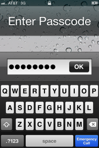
I am introducing a new feature here at devinhenkel.com, the Design Asshole Of The Month. Each month, I will point out a design flaw that really gets my hackles up. The inaugural award goes to Apple Computer, Inc. Those of you who know me may find it a surprise that I would choose to hand this out to Apple, since I am generally a fan of the fruit company from Cupertino. But this example seems to fly in the face of all that I find exemplary of Apple’s design aesthetic.
I wouldn’t even have caught this offense if it weren’t for our IT department pushing out a new policy that forced a passcode on the phone which required characters as well as digits to be valid. You can experience the same issue if you turn on the passcode for your iOS device and switch the “Simple Passcode” toggle to off.
You may ask yourself, “What’s the problem? This looks fine to me.” However, once you use it, you realize that the “Emergency Call” button is placed precisely where the submit button is placed for every other iOS form you’ve ever interacted with is usually situated. I have hit the “Emergency Call” button instead of the “OK” button roughly 10 out of 10 times.
If you’re going to establish a chrome for an OS, you should really hold that chrome sacred unless there’s a really good reason to violate it. The result is that the least desirable interaction has been given the most desirable real estate. It seems to me that the “Emergency Call” button should appear somewhere above the interaction space and that the blue button should be “Go” like it is everywhere else.
I probably would have let this slide, but I’m still a bit steamed about the lack of “Mark All As Read” in the iOS mail programs…
So, Apple, breathe deep the fumes as you enjoy the first ever devinhenkel “Orange Sphincter Of Doom.”
*
This butt’s for you.


