I generally think of usability in terms of 3 dimensions: Utility, Usability, and Experience. In order to be truly usable, a system needs to be useful, easy to use, and compelling. If any of these three dimensions doesn’t get the attention it deserves, it’s Utility. Visual designers are focused (often, to a fault) on ensuring that an experience is compelling. Traditional usability work generally ponders whether or not the tasks necessary achieve the goal states for a system are intuitive. The missing piece to the puzzle is whether or not your intuitive and compelling experience is actually accomplishing goal states that are worthwhile.
Utility describes a system that does what you need it to do and only what you need it to do. Too many applications today offer bells and whistles that are there only for histrionics. Others may accomplish a particular piece of a process but ignore others. One of the best ways to guarantee utility is to have a clearly defined specificity of purpose. Today’s example has just that.
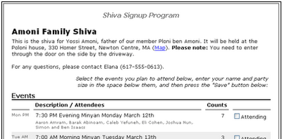
Dan Bricklin, the inventor of the spreadsheet, has a post on his log today about a new application he’s written. Dan belongs to a fairly small congregation. Since the size of the congregation is small and the demands for sitting Shiva are somewhat resource intensive, finding people to sit Shiva when a member of the congregation passes is sometimes difficult. Looking for a way to leverage technology as an aide in this process, Dan has created the Shiva Signup Program.

While the system may not have the “sex appeal” of some of today’s Ajax/Flash/DHTML-all-to-hell apps, the specificity of purpose does not call for it. In fact, the solemnity of the occasion all but excludes the need for a “slick” interface. The bottom line is that here is a system that addresses a specific need, does so with a minimum of effort (for both admins and end-users), and doesn’t try to do more than it should. I wish more applications would rein themselves in like this.

