I just stumbled upon a cool tool and an even cooler set of data…
The tool is Twist. Twist is, basically, a way to compare volumes of traffic on Twitter based on words contained in that content. For example, I typed in “cubs” and “white sox” (take that, Sox fans) and it drew up a nice graph of Twitters containing those phrases over time. It’s fairly easy to see how this may give you some insight into the current zeitgeist (at least among the Twitter-using demographic).
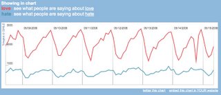
After another couple of comparisons, I tried “love” and “hate.” What I got was this:
What I find so freaking interesting about this data is that, if you normalize for the cycles of rising and falling activity, hate looks like a low-level flat line while love has a wavelength. Can we infer from this that Twitter users have a chronic nagging sense of hate, but tend to have ground-swells of love that then fall off rather rapidly? What’s even more interesting is that that red line represents the population as a whole. Everyone using Twitter swells with love in the P.M. hours, but isn’t feelin’ it in the morning. I’m not sure what happened around 9:00 P.M. on the 14th, but it must have bummed everyone out…
Check Twist out. If nothing else, it’s a fascinating way to pass a few minutes. If you find interesting comparisons, please post them in a comment.


