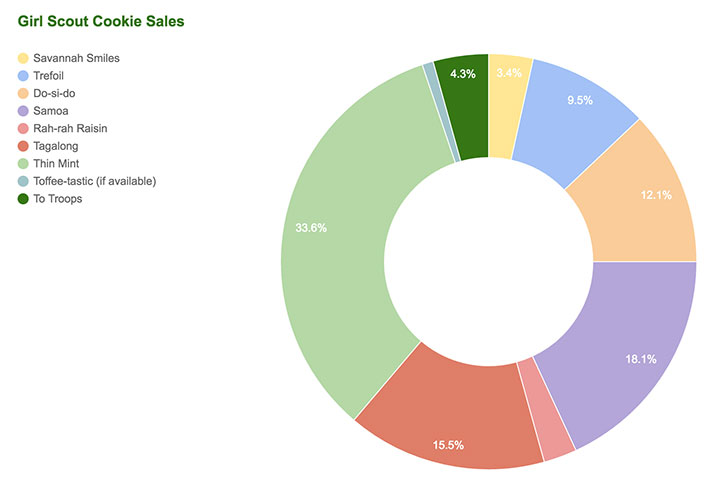
My wife sent me a text: “The cookie orders are due tomorrow and we haven’t sold any!” Normally, I take the order form to the office and drum up some sales there, but this year I had been traveling quite a bit. So, in a hail mary move, I sent an email to the office distribution list and hit up Facebook for orders. We ended up selling the most in the troop. As a result, I had to hand-deliver a batch to Florida and we’ve had to make a few road trips to fulfill people’s orders.
Given that I was fielding online orders, I set up a Google Sheet to track orders. Since I had the data in a spreadsheet, I decided to add a visualization to see which kinds of cookies were performing better than others. The chart seems to reflect what my gut would tell me anyway, but it’s still interesting to look at. I’d be interested to see how much the overall cookie numbers compare.
Next year, we’ll see if we can’t find some more creative ways to boost sales.


